Visualize Wi-Fi Performance Using Tableau
A picture is worth a thousand words… especially if it helps you make informative decisions about your wireless LAN infrastructure. Often we perform a wireless survey after installation, but how can you monitor performance on an ongoing basis?
Many network monitoring solutions offer valuable insights into network performance including graphical visualisation of data. Sometimes you might want take the data a step further and apply your own interpretation, or correlate with other data sets, this is where Tableau comes in!
Tableau is a data visualisation, analytics and business intelligence tool designed for everyone to use. Its power is the ability for anyone to throw data at it and easily produce valuable insights using beautiful graphics. In this example I’ll show you how to export, visualise and interpret wireless client session data to understand Wi-Fi coverage performance using RSSI measurements. Hint- download the 30 day evaluation if you don’t have Tableau- you won’t regret it.
Step 1 - Collect The Data
The data source we are using is the Client Session Report in Cisco Prime Infrastructure, other wireless monitoring systems like Aruba Airwave have similar reports. A session is recorded for each client for the duration of their association. Each session includes average SNR, RSSI and other metrics.
Create a new Cisco Prime Infrastructure report and be sure to include RSSI and AP Radio data fields. Select the timeframe that you wish to analyse, in this case I have chosen last 1 day.

Save and export the report to create a CSV file that we can then import into Tableau. If the data is split into several smaller files you should combine them, Linux and a simple shell script comes in handy for this. Remove the top four rows so the column headers are row 1, your resulting file should look similar to the screenshot below.

Step 2 - Connect Tableau To Data
Open Tableau and click ‘Connect to Data’, then select ‘Text File’. Change connection to ‘Extract’ to optimise caching of the data, then click ‘Go to Worksheet’. Save the data extract to a file when prompted.

Step 3 - Visualise!
Dimensions are commonly text/date columns, Measures are typically numerical rows of data. Click the ‘Show Me’ button to view the types of graphics available.

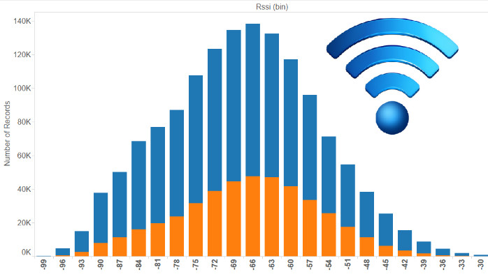
We’ll view the distribution of RSSI performance by counting the number of client sessions that fall into 3db bins. This will show us the overall coverage performance, based on average RSSI for each session.
We’ll create the 3dB bins by right-clicking the ‘RSSI’ measure and selecting ‘Create Bins’, then enter ‘3’ for the size of bin. Each ‘bin’ or column will represent a range of 3db, for example values -65,-66,-67.
Now we can add the elements to the chart, double click ‘Number of Records’ measure to add it as a row, then double click ‘RSSI bins’ to add it as a column. It should automatically create a bar chart as shown below. Sometimes there will be some bad data points where RSSI is reported as 0 or -128db, right click on these columns and Exclude them.

Step 4 - Interpret
From the graphic we can see that RSSI values are weighted towards to center of the graph around -66dBm, depending on the design of the network you may expect your clients to typically be connected with a signal stronger than -67 for example. If you see the sessions weighted to the left side it is likely that coverage is poor.
Let’s take it a step further and compare 2.4Ghz coverage versus 5Ghz coverage. First we’ll group the values for each frequency by right-clicking on the ‘AP Radio’ dimension and then clicking ‘Create Group’. Group the values as shown below.

Now we can drag the new Dimension (AP Radio Group) to the colour mark:

We can now see the two things, the quantity of 5Ghz sessions compared to 2.4Ghz sessions, and also the coverage (RSSI) performance for each. In a well designed network there should typically be a lot of orange (5Ghz sessions), with all sessions weighted to the right side where sessions fall into bins with strong signal strength.
Example of bad wireless coverage and poor 5Ghz usage.

Example of good wireless coverage, and high 5Ghz usage.

Interested in seeing performance for a particular vendor/manufacturer? Simply right click on the ‘Vendor’ measure and select ‘Show Quick Filter’ you can then use the filter selection box to view only the RSSI performance for Apple devices, or Intel for example.
Once you’ve created your report you can potentially publish it to your own internal Tableau (web) reporting server where your team can view/use the data. Implement a schedule and have it automatically update.
This article barely skims the surface of Tableau and the potential uses for monitoring network performance. Multiple data sources can be blended together to tell a story, for example, why not link your Wi-Fi chipset inventory with client sessions (using client MAC address) to view RSSI performance by chipset, or even driver version!